In December 2025, the Social Links team introduced Timeline, a new feature that allows investigators to see events chronologically.
This tool organizes a chronological order of objects on the graph, including social media profiles, posts, and other digital traces. Every element displayed on the graph/table/map containing a date inside of it will be automatically displayed on the timeline, which is integrated in the graph view.
The Center of Excellence tested this feature, demonstrating how various events can be represented on the Crimewall timeline.
Trump’s Election Victory Sending Bitcoin “to the Moon”
Bitcoin has had an incredible run over the past two months, reaching record-breaking highs and nearly doubling its value since earlier this year. Social media can gives us a unique view to the why’s and what’s driving this surge. One key factor? Donald Trump. The former president has made multiple statements about Bitcoin throughout his campaign, with speculation and lots of chatting following.
With this in mind, we turned to X to see what the data could tell us. We use “Advanced Twitter Search” to look for relevant posts mentioning both “Trump” and “Bitcoin”, with some extra filters.
After getting all posts (limit to 1000), if we open the Timeline, we’ll notice a clear spike in activity on November 5th—the day of the U.S. presidential election.
Interestingly, when we overlay the social media activity with Bitcoin’s price chart, there’s a direct correlation (see the chart here). The value of Bitcoin begins to rise sharply on November 5th, coinciding perfectly with the election results and the spike in discussions about Trump and Bitcoin.
Selecting only the posts from 5-6th of November, and running “General Sentiment Analysis”, we clearly see that Trump’s win reignited optimism within the crypto community, as many saw his presidency as a potential boost.
Check the total amount of sentiment. More than 93% of the total is either positive or neutral.
Sentiment Analysis on Italian Politicians
Silvio Berlusconi was probably the most famous Italian politician of all time. His figure, character and way to approach politics have changed the way the Italian politicians in general approached politics, so we can assume that his impact was huge. Despite being a huge entrepreneur and politician, he was involved in a lot of scandals that newspapers have spoken a lot about.
In this part we will try to see how “Il Post”, which is a very known, reliable and respected newspaper in Italy has spoken about Berlusconi in the last few years, trying to make some intelligence thanks to the maps view.
Steps:
Create a Twitter advanced search element and put it into the graph;
Compile TwAS with the keyword “Berlusconi” and ask to get me results just from the official newspaper page (@ilpost);
Set the maximum number of results on 100 and run Twitter search post by multiple parameters;
Get 100 posts into the graph; open the timeline view;
The timeline takes into account the period from October 2022 until October 2024;
From this first image it is possible to notice one important thing: between April and June 2023 we had the maximum amount of posts ever posted about him; by this data we can easily assume that something happened during that moment;
Zooming in into the timeline, we can see dates in a more specific way;
We now see that 25 posts on 35 were published between 11 and 14 June 2023;
If we zoom more, we can see not just the dates of the posts but also the hour they were posted:
We can see seven posts published in the morning of 12.06.2023, the day Berlusconi died; then, three more posts on the afternoon; then more posts the day after.
We can easily click on any post and see the content displayed in the properties fields on the right. This is the text of the post:
After the first post about the event itself, IlPost started speaking about the character of Berlusconi himself: by clicking on the next posts from the same day, they make an interpretation of the event in different perspectives, points of view.
In this example we have shown that the timeline feature can be helpful to:
Quickly understand and analyse the changing behaviour of subjects, companies, people and ideas;
Quickly find crucial moments in the analysed target;
Quickly understand the most important moments of the life of the target;
Without timeline features, in this case, we would have had just a huge amount of posts to analyse, to manually insert the data to, but in this case we just had to click on “Timeline view” to display in a nice order the following of the events, making the process of analysing the data and gain valuable information much easier for the investigator.
To sum up
The Timeline is very complementary to other analytical features of CW, such as Maps, Tables and Navigation;
The Timeline can be used universally for any kind of element containing a location property, which is not limited to social media;
Consequently, this means that the feature can be used for retrospective analysis of any chain of events which may be reflected in different kinds of data, including internal documents;
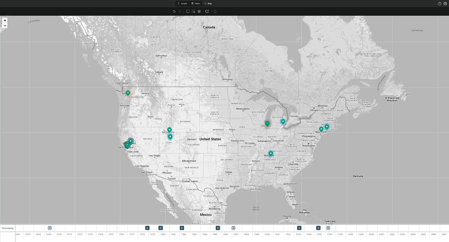
What we have in the example chosen to illustrate those thoughts is the timeline of Ted Kaczynski, also known as “Unabomber”. The CW document contains 21 timestamps related to bombing instances as well as some of the life landmarks of the person in question.
We have also used Navigation to filter the bombings that share a common category, such as “Universities”, “California”, “Aviation-related” and “Utah”.
The timeline in this case may potentially let us see chronological patterns of activity, and can be combined with the Map view for potentially deeper analytical insights into the case.


